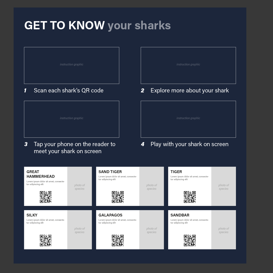
Introduction

The sketches below were collected from participants who were asked to draw a shark, without being given any context behind it.
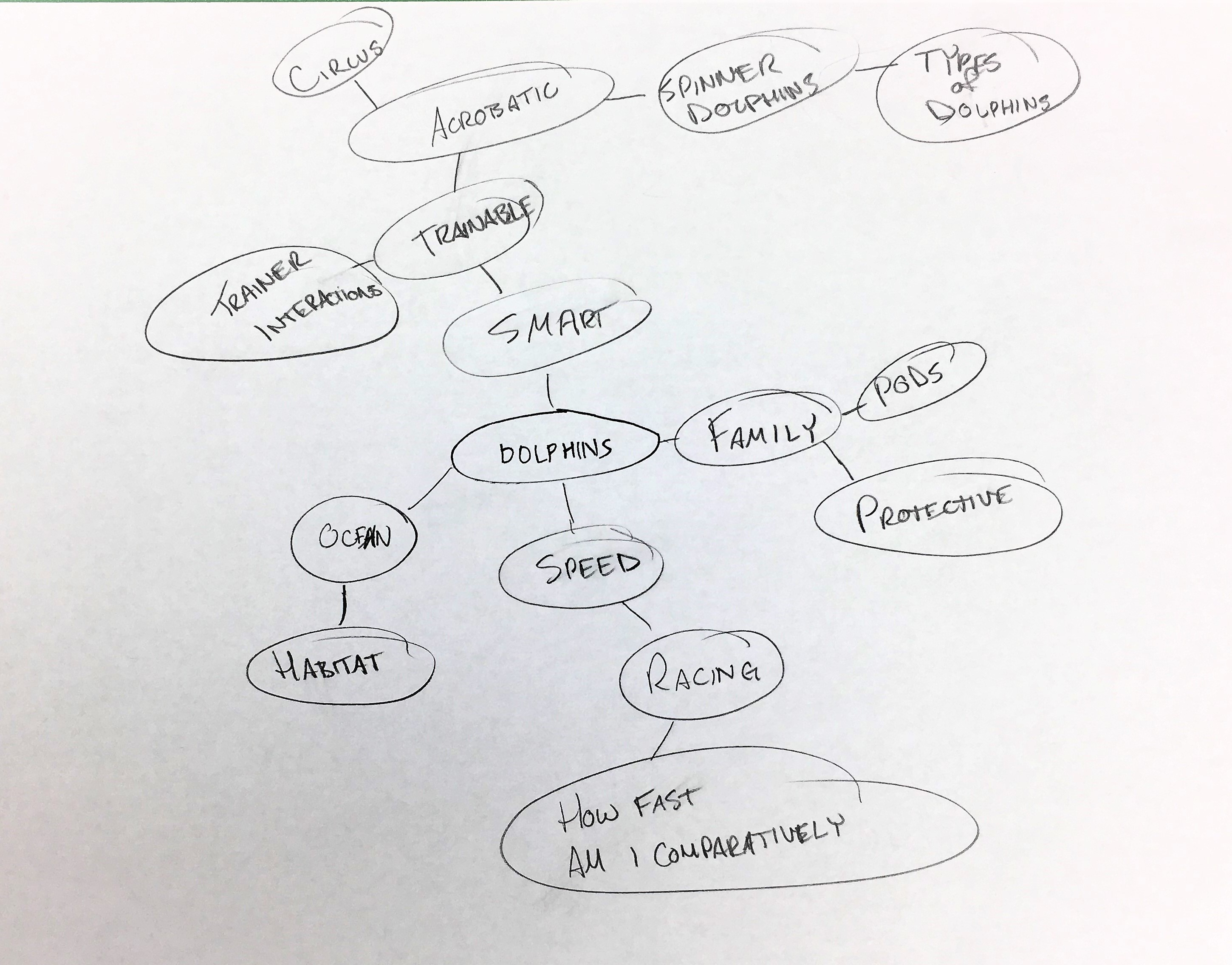
Click the blinking dots to see what the participants had to say about their own drawings.


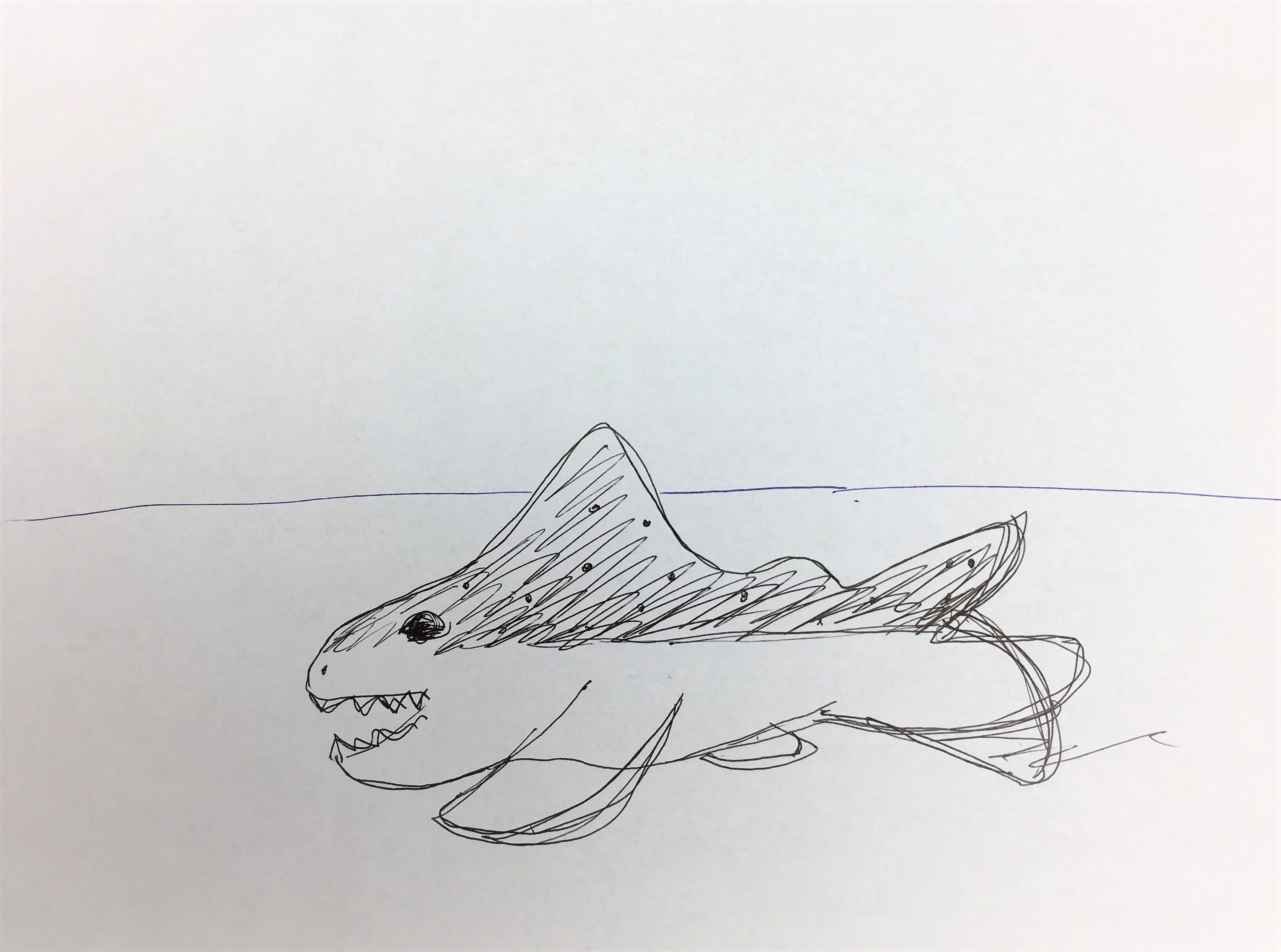
"I drew the fin popping out of the water surface. Fin is the most distinctive part of a shark."

"I wanted the teeth to look scary and sharp."

"I picture sharks in grey colour."

"I was confused whether sharks have a split tail or not."

"I saw a dotted pattern on a shark at the aquarium."

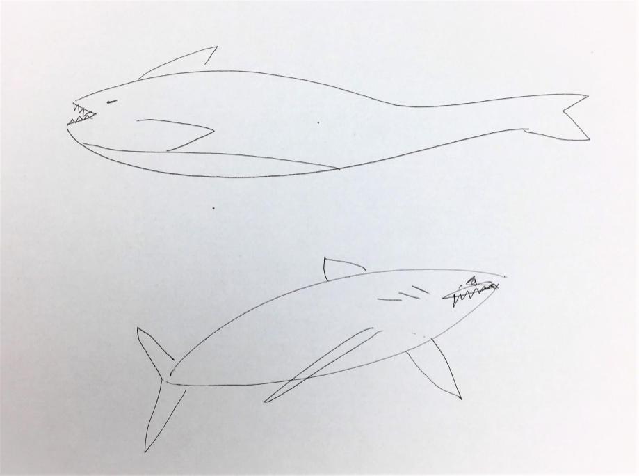
"The colour I think of when I remember shark and shark fins is like a dark, slate grey colour."

"I imagined the shark teeth to be small and pointy and a lot in number. I do think sharks are scary because of their teeth."

"I did not think drawing gills was important. I concentrated more on the silhouette."

"I have seen sharks with small bodies get into fights. I knows that they are very violent, I have seen sharks with scars due to getting into a fight with other sharks."

"I remember the creepy little gills on the side and the teeth obviously."

"I drew the fin that everybody knows sharks for."

"I could not recollect the overall shape of sharks or how the head looked."

"I did not draw the shark with its mouth open because that is not what sharks actually look like unless they are eating."

"I think I forgot to draw gills because they are not the most distinctive characteristic of a shark."

"I wanted to show the shark fin above the water surface. I think the fin is the scariest feature of a shark, because movies and documentaries usually picture fins as a representative of fear."


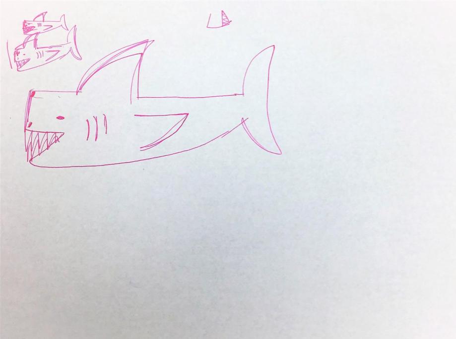
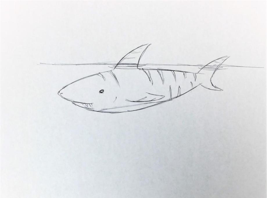
With a few exceptions, the portrayal of sharks in most sketches was stereotypical - scary and violent with sharp teeth, beady eyes and a fin poking out of water. What do you think this means?


Many humans have a negative perception of sharks!


Context:  Research project for the course of 'Psychology Research Methods' in collaboration with the Georgia Aquarium

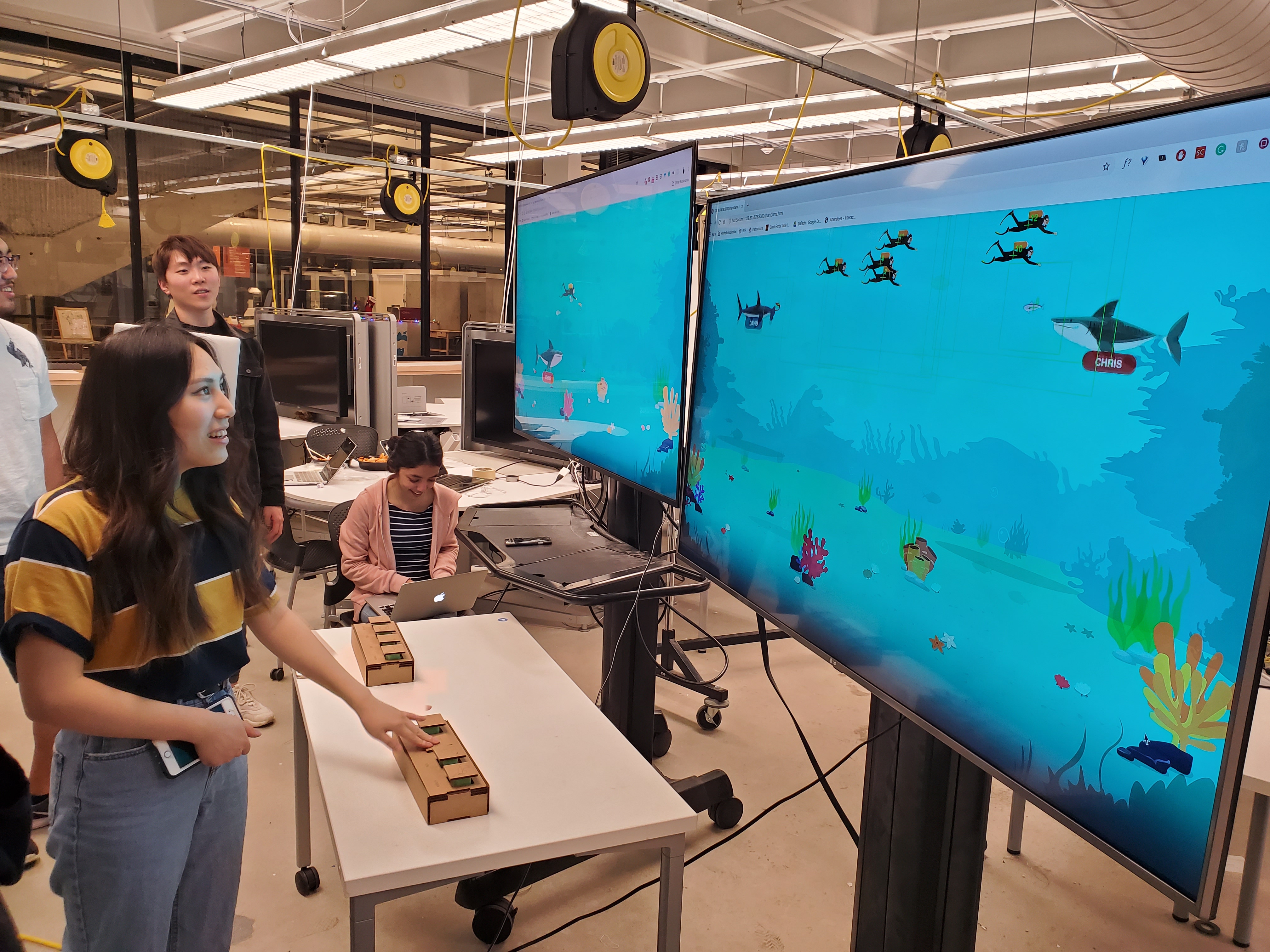
Instructor:  Dr. Carrie Bruce

Duration:  August 2019 - December 2019

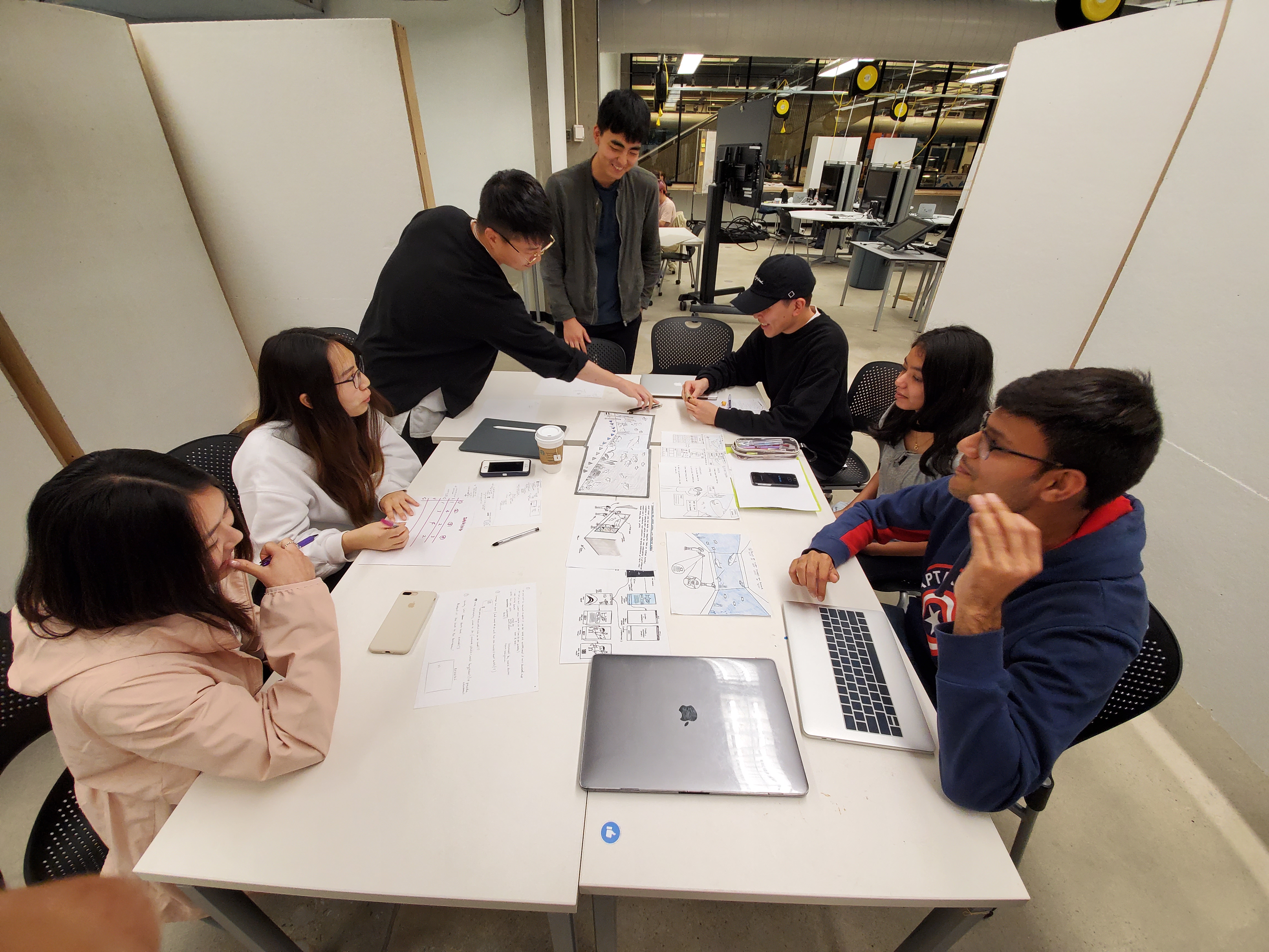
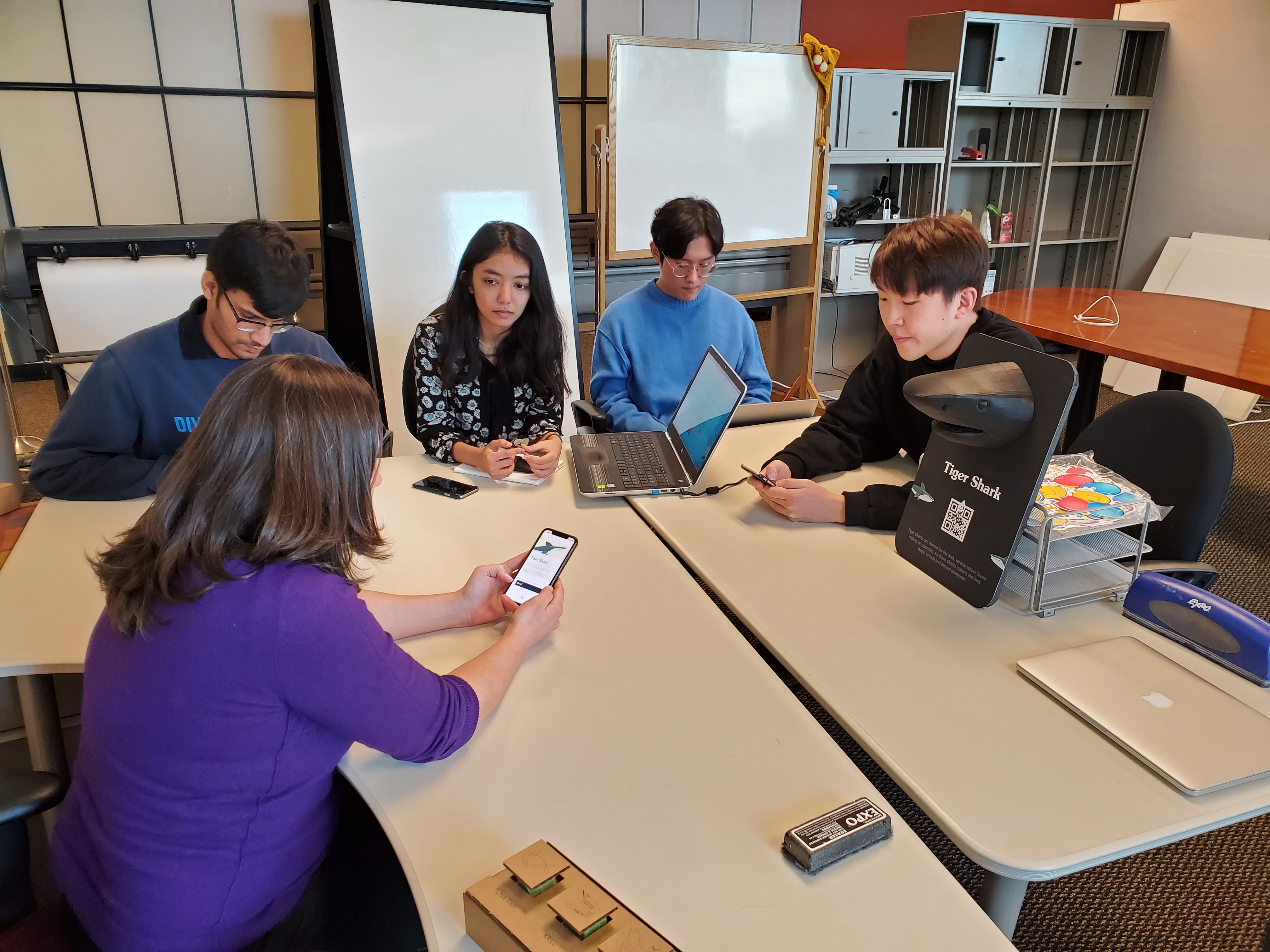
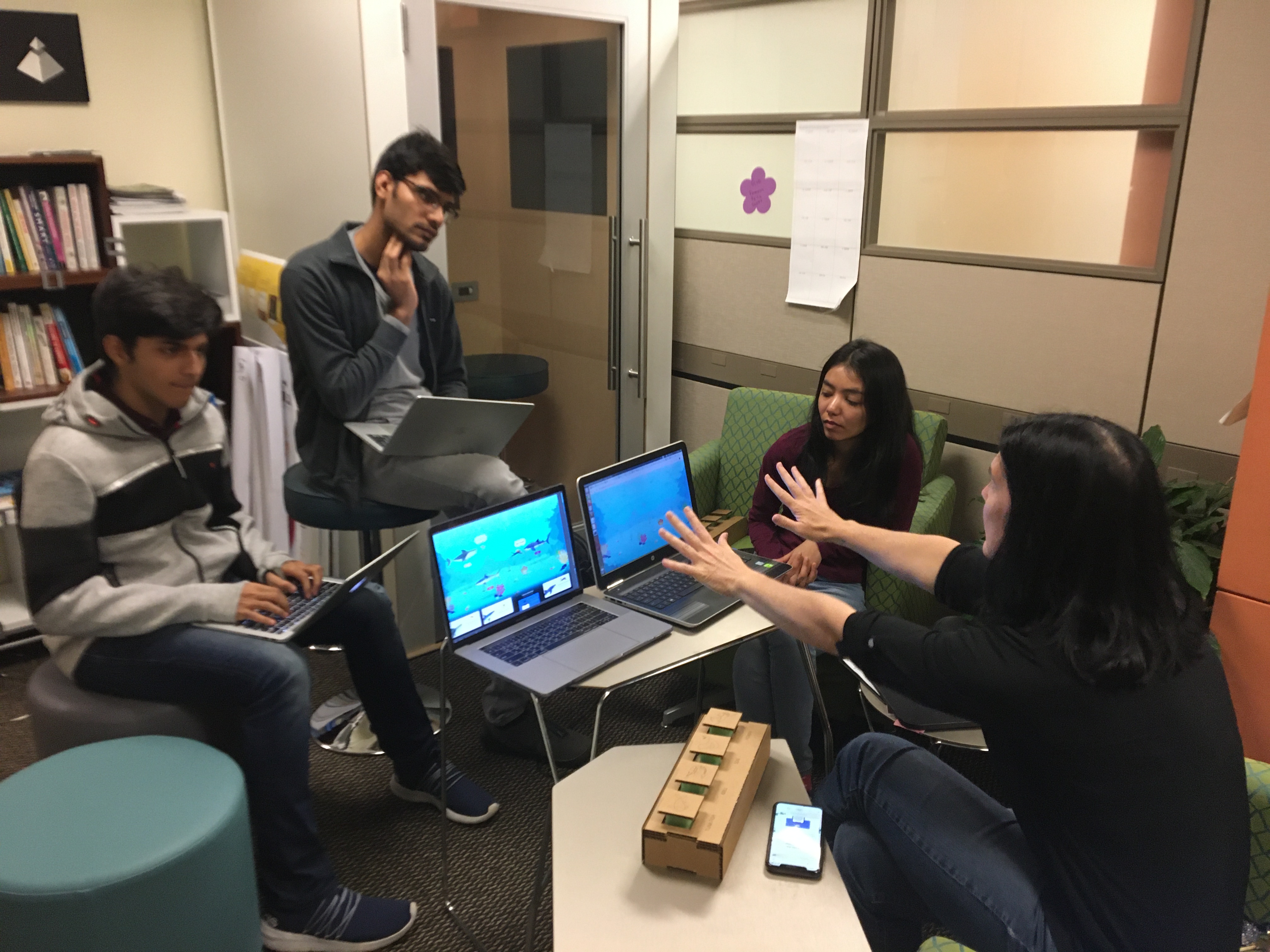
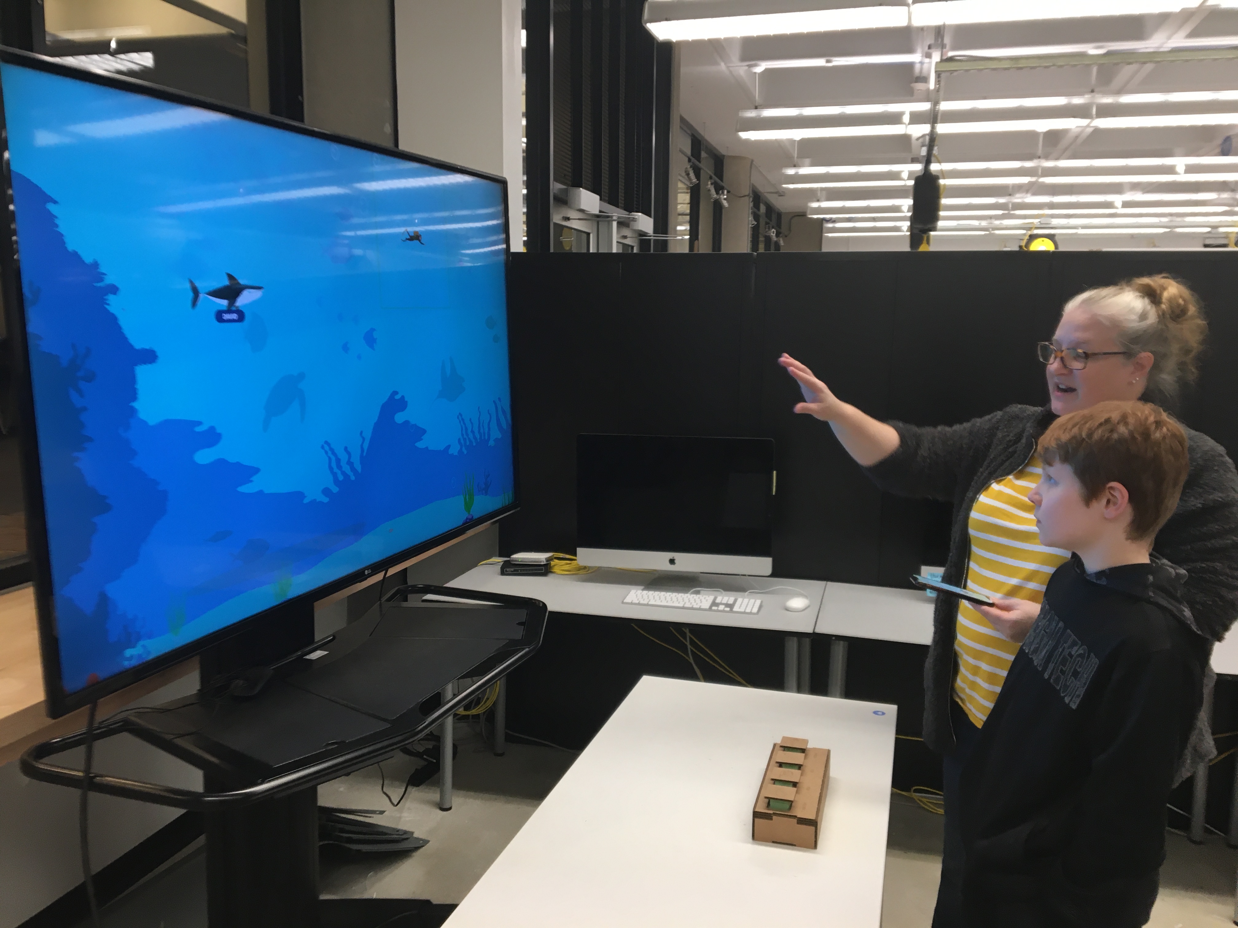
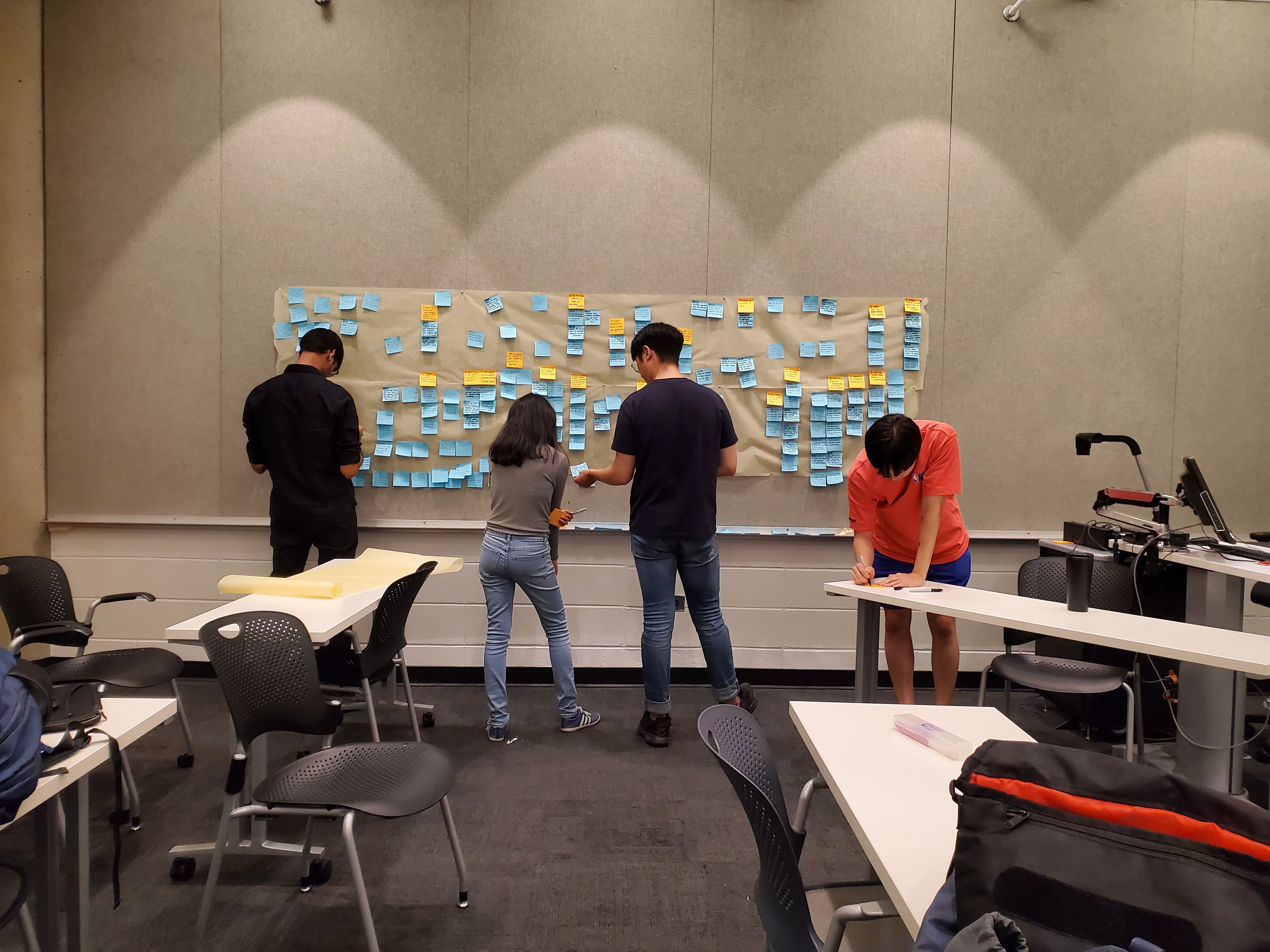
Team:  Hyun Tae Park, Jae Hyuk Kim, Ruchita Parmar, Aditya Kundu, Arpit Mathur

Tools:  Elicitation Methods, Interviews, Observations, Surveys, Social Media Analysis, Sketching, Storyboarding, Paper Prototyping, Wireframing, CAD modelling, Solidworks, Adobe Illustrator, Laser Cutting, Usability Testing

Contributions:  Performed competitive analysis and background research, Conducted elicitation methods, Created sketches, paper and cardboard prototypes, Developed the interactive screen, Conducted usability testing, Recruited participants for various research methods
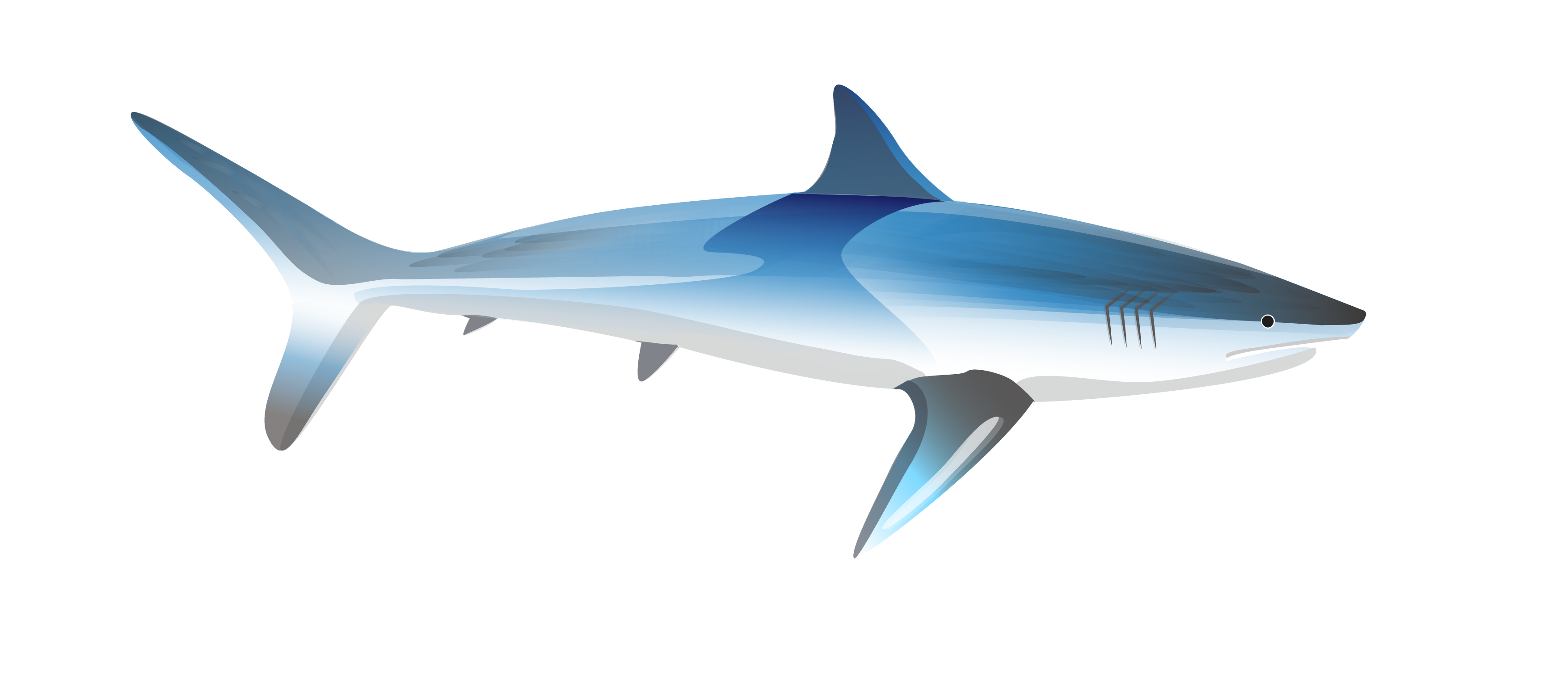
Research

Image Courtesy: Georgia AquariumGeorgia Aquarium, boasting more than 100,000 marine animals, is the largest in the Western Hemisphere. They revealed their expansion plans for the year 2020, featuring a floor to ceiling saltwater gallery for one of the most misunderstood species in the ocean - sharks. The gallery is designed to evoke a feeling of fear in the beginning and turn it into curiosity and finally amazement. Our team was assigned the task of tapping into the minds of the visitors to change their perception of sharks from fear to fascination and finally to conservation, by means of this gallery.


Preliminary Research
To test the waters before we dive in


  • Literature Review

    We studied design concepts related to museums, zoos and aquariums and also the various types of motives with which audiences visit these places.

  • Research on Sharks

    We read up facts, misconceptions, eating and mating habits as well as the anatomy of various shark species.

  • Competitive Analysis

    We analysed other aquariums and museums from around the world for their strengths, weaknesses and general design ideas.


Fact or Myth?
Tap the flashcards to find out!


User Research
We employed five research methodologies spanned over a duration of two months.


  • Observations5 aquarium trips
  • Survey202 responses
  • Interviews12 participants
  • Social Media Analysis58 posts
  • Elicitation Methods21 participants


Observation Objectives:

  • ○     To form an understanding of the exhibits and facilities present at the aquarium.
  • ○     To observe visitor behaviors in context of the aquarium.
  • ○     To focus on aspects such as where they go, which routes they take, how much time they spend in certain parts of the exhibits, how they express their feelings verbally, facially and physically.


Online Survey Objectives:

  • ○     To get a sense of the most popular exhibits at the aquarium.
  • ○     To get a distribution of the age-group and other demographics of the visitors.
  • ○     To narrow down potential problem areas within the exhibits to discuss in depth during interviews.


Semi-Structured Interview Objectives:

  • ○     To get a qualitative understanding of the journey of aquarium visitors - their preferences and experiences as well as desirable and undesirable features of the exhibits.
  • ○     To uncover how visitors were using technology while at the aquarium - apps they used for communication, looking up information online and taking pictures.
  • ○     To understand the group dynamics involved within different types of visitor groups - families, groups of friends, couples and solo visitors.


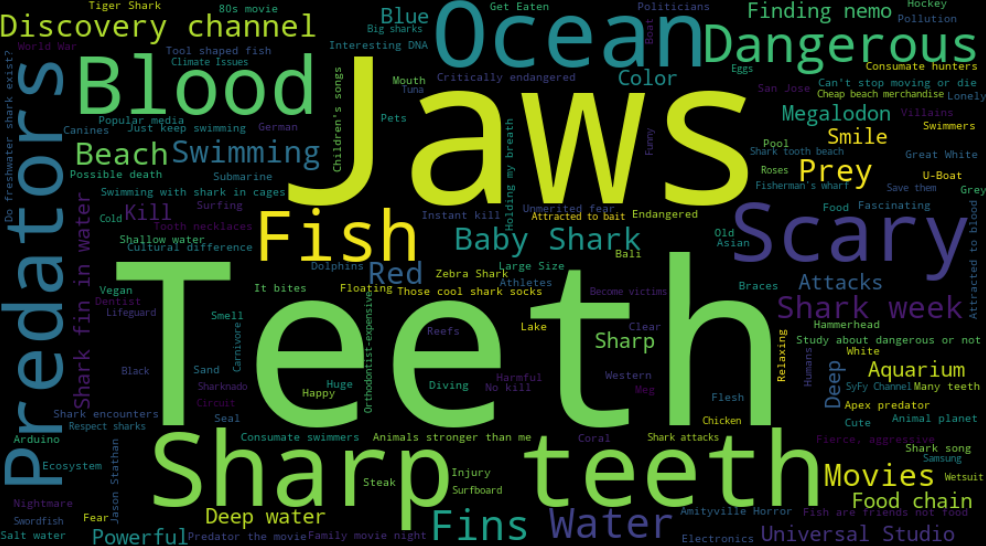
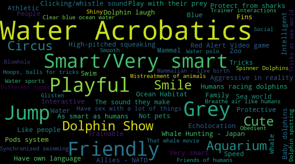
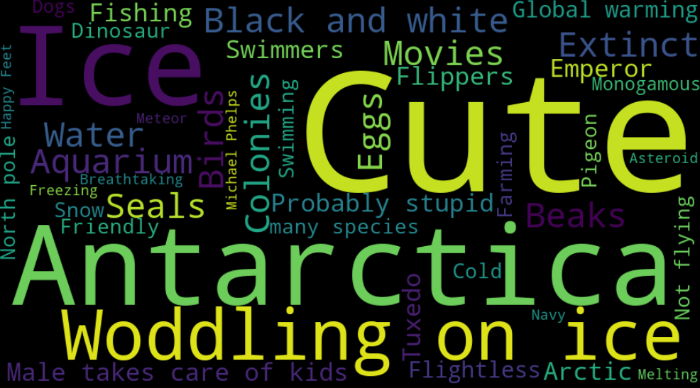
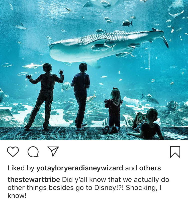
Social media analysis
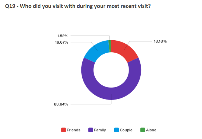
A snippet from the survey data report
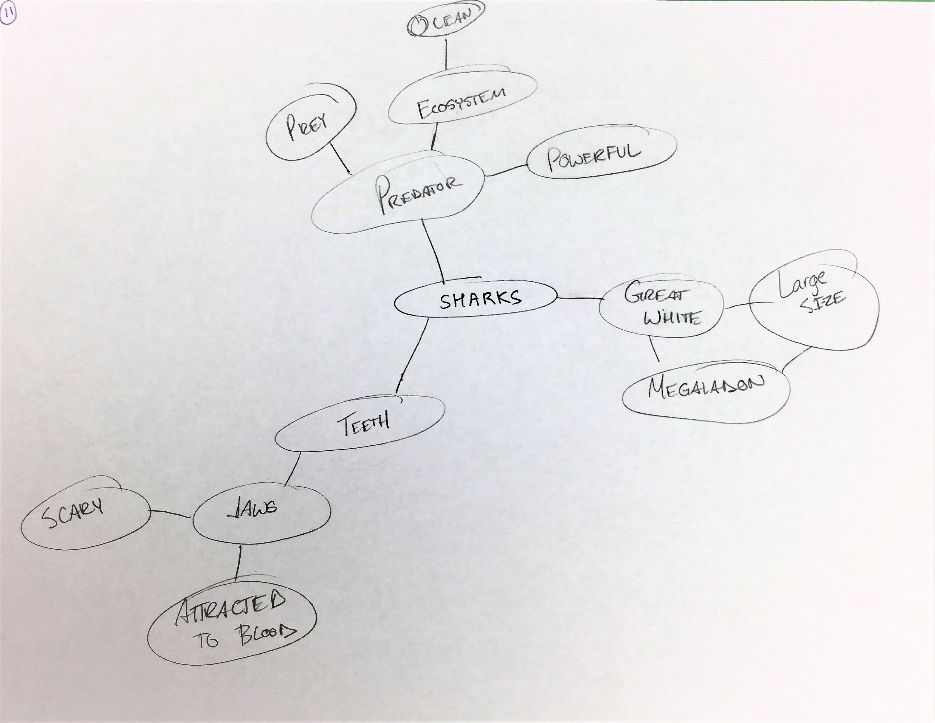

Social Media Analysis Objectives:  

  • ○     To understand the emotions and thoughts of users through the posts, images and captions they publish online.
  • ○     To witness an “in the moment” experience of the users from their own perspective.


Sketching Objectives:  

  • ○     To make the concept of 'perception of sharks' less abstract and more tangible.
  • ○     To find out the existing impression of sharks among people.
  • ○     To verify whether people really find sharks scary or menacing.
  • ○     To re-emphasize that sharks are indeed misunderstood with the collected data as proof.


Personal Meaning Map Objectives:  


  • ○    To qualify contrast in the words users associated with Sharks as opposed to Dolphins/Penguins; since based on our survey data, the Dolphin Show and Penguin exhibit were found to be the most popular among visitors.
  • ○    To find out the reasons behind the popularity of dolphins and penguins based on the associations people make with them.
  • ○    To utilize these learnings to somehow transfer a few of these representational qualities to sharks to improve their portrayal.

The images above visualise the frequency of the words associated with sharks, dolphins and penguins.
No prizes for guessing which word cloud belongs to which animal!

Analysis

*Obligatory picture of the team with a wall full of sticky notes*

The data collected through the first four methods was mainly about the likes, dislikes and pain-points of aquarium visitors. For this data, we used affinity diagramming to discover and organize our findings and insights. However, elicitation methods were purely aimed at unconvering the perception of sharks among people. Hence, we analyzed that data separately.


Research Findings
We relied on these primary findings to lead us to the ideation phase.


  • ○     Most people visit the aquarium with either a group of family or friends.
  • ○     Both kids and adults enjoy these exhibits more when they can relate to the personified traits of marine animals.
  • ○     People like seeing diverse marine animals in unique and unusual settings.
  • ○     Visitors enjoy getting a chance to physically interact with the marine animals.
  • ○     Parents sometimes have to compromise their own experience at the aquarium so that their kids can have more fun.
  • ○     Visitors want to learn fascinating trivia about marine animals but the current sources need some improvements.
  • ○     Visitors felt serene and peaceful while at the aquarium.
  • ○     Very few people download or use the Georgia Aquarium mobile application.

Ideation

After multiple brainstorming sessions, we shortlisted four design ideas.


A Shark's Point of View

  1. Through an image recognition app, the user scans a shark swimming inside the viewing gallery.
  2. Then the user is connected to the scanned shark and can now watch the real-time point of view of the shark as it moves.
  3. As the shark comes across surrounding objects such as reefs, fish, corals or even visitors, depending on the object in the shark's view, the user can see whether the shark thinks that object is food or not.

Sketch Courtesy: Arpit Mathur

Scan A Shark

  1. Through an image recognition app, the user scans a shark swimming inside the viewing gallery, similar to the previous idea.
  2. The users can then check the shark info card that pops-up. These cards include the shark’s anthropomorphized information such as a name, animated appearance, background story and personality.
  3. The user can save that shark's profile and can check back later to see any changes in the shark such as growth of its fin or tail.

Sketch Courtesy: Hyun Tae Park

The World Without Sharks

  1. Visitors align their feet to the footsteps displayed on the floor at the entrance of the corridor.
  2. This would initiate the visuals on the screen to their side. The visitors would then follow the arrows being projected on the floor.
  3. As they continue walking, the percentage of sharks in the ocean on display will gradually decrease and the visitors will be able to see the corresponding harmful effects on the marine ecosystem.


Swipe A Shark

  1. The interactive screen is divided into two parts - upper part for parents, lower part for children.
  2. Users can drag a shark from the viewing window into their screen. The virtual shark then greets the user and narrates its own story.
  3. Parents can read the description of the shark while children can play a game with the shark and also click a picture with it.

Sketch Courtesy: Jae Hyuk Kim

Stakeholder Feedback
Hunt for 'The Best Idea' out of the four


We presented these ideas to the aquarium clients as well as to a group of four users.

The former group was inclined in the favour of the third idea since it highlighted the role of sharks in the ocean.

However, we received mixed responses from the second group.

Ultimately, we decided to incorporate unique aspects of each of these ideas into the final design.

Proposed Solution

"Do all four ideas! We will find you a wall at the aquarium," they said.
But they did not find us a wall.

So we came up with this design.

Posters would be hung up at various spots near the gallery. Scanning QR codes for each species on the poster would allow users to access more information about that species on their phones.

The scanned QR code would direct the user to a web application where they could personalize their shark by naming it. The user could then read up facts and trivia about their shark and share it with their group.

At the end of the exhibit, the users would come across a large screen. Tapping their phones onto the NFC-readers next to the screen would drop their shark into the ocean displayed on the screen. Now the users can drag up different food items from the food-tray at the bottom of the screen to feed their shark. Among the mix of food-items on the tray is also a human. When the users try to feed their shark a human, the shark would gracefully decline the offer by saying "Not Food!".

When the screen has been inactive for a long time, the ocean bed begins to turn stale due to the absence of sharks in the ecosystem.


First Testing Session
What should we change before we move to a higher fidelity prototype?


We conducted a think-aloud session with four participants. Key suggestions we implemented based on their feedback were:

  • ○     A dedicated poster for each species with a single QR code on it
  • ○     3D appearance to the poster with a shark head on it
  • ○     Less information dense web application
  • ○     Food-tray panel detached from the screen for easier access


Final Design
After making suitable improvements to the initial solution.


Many such posters will be placed on walls near every viewing gallery. Each poster will have a different shark species protruding out of it.

Multiple arcade-game like button panels will be stationed next to each other, nearly five feet away from the large display screen. The height of the panels will be varied for easy access to adults, children and wheel-chair users alike.


When the QR code on the poster is scanned, users are directed to a web application where they can name their scanned shark and read information about that particular species.

Through a card-based layout, the site provides bite-sized information that includes fun facts and a gallery full of shark images.

At the end of the exhibit, the site gives the users instructions on how to use their phone to drop their personalized shark into the large interactive display.

Prototype Courtesy: Aditya Kundu


Users can feed their shark to see its reaction to each food item. Info-cards at the bottom of the screen talk about the eating habits of the shark species in focus. When there are no sharks on the screen, it will display what the state of the ocean would be if sharks did not exist. The aim is to make the visitors aware of the critical role that sharks play in the marine ecosystem.

Testing

The part where stakeholders make you question every design/life decision you ever made.

We first conducted individual cognitive walkthrough sessions with five participants who were experts in either user experience or exhibit design. Three of these were our clients from the Georgia Aquarium and the other two were Georgia Tech professors.

After this, we performed two moderated usability testing sessions - one with a group of four friends and another with a mother and her 13 year old son. Paticipants were asked to complete a series of tasks such as 'Scan a shark from the QR code on the poster' or 'Feed your shark a tuna fish.'


Feedback
The major positives and negatives that we uncovered through the testing phase.


What Worked Well?

  • ○     The shark head on the poster was a big hit owing to its visual appeal and tactile nature.
  • ○     The design utilized the familiarity of QR codes to its advantage.
  • ○     The information cards on the website would work well for effective crowd management to keep people engaged while waiting.
  • ○     Personification of the scanned shark by naming it was an appreciated feature.
  • ○     The aspect of ‘Trying to feed a human to the shark' was amusing to everyone.
  • ○     The interactive screen was a fun learning experience for most users.

What Could Be Improved?

  • ●     Some users might not be willing to scan QR codes without knowing what is in store for them.
  • ●     The information cards could use some more structure and indexing for quick skimming and just-in-time information.
  • ●    The message behind the dead and barren ocean in the absence of sharks was unclear for most people.
  • ●     There needs to be a way to detach the experience from phone devices to make the interaction more accessible.
  • ●     The interactive screen should have variables dependent on the real-time crowd strength at the aquarium.